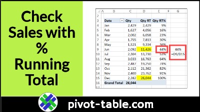
Excel Macro to Filter and Print Quick Pivot Table Reports

With a report filter in your pivot table, you can choose a region name, or employee, to show the data for selection only. This macro automatically chooses each item in the report filter field, and prints the pivot table, showing that data. It’s a quick way to print out a set of monthly reports.

Continue reading “Excel Macro to Filter and Print Quick Pivot Table Reports”

Show Years in Separate Lines in Excel Pivot Chart

If you make an Excel pivot chart to show monthly data, a line chart might have all the dates in a single line. This video shows how to group the dates, if needed, and how to show years in separate lines. It just takes a simple step – move the Years field to the pivot chart’s Legend (Series) area.

Continue reading “Show Years in Separate Lines in Excel Pivot Chart”

Excel Pivot Table Values Problems with Average Function

When you add a value to an Excel pivot table, it automatically summarizes the values by Sum or Count. Later, you can change the setting, to use a different summary function. In this example, you’ll see how to use the Average function. You might see errors, and there are differences between a normal pivot table, and a pivot table where data was added to the Data Model.

Continue reading “Excel Pivot Table Values Problems with Average Function”

How to Use Pivot Table Top 10 Filters to Analyse Sales Data

The Pivot Table Top 10 Filter feature lets you focus on what’s working well. Create a report that shows sales from the top regions, or show the best-selling products. You can use this feature to show the opposite too. Which products are selling poorly? Which cities or regions aren’t doing well? These two short videos show quick ways to analyse sales data with pivot table top 10 filters.

Continue reading “How to Use Pivot Table Top 10 Filters to Analyse Sales Data”

Show Difference in Values in Excel Pivot Table

You don’t need fancy formulas in a pivot table, if you want to show the difference between values. Use this built-in feature instead! With a couple of clicks, you’ll see the difference between sales in East and West regions. Or, see the percent difference in sales for this month and last month.

Continue reading “Show Difference in Values in Excel Pivot Table”

Prevent Selection of ALL in Pivot Table Report Filter

In some Excel pivot tables, you might want to prevent selection of the “(All)” option in a Report Filter. There’s no built-in option to do that. Instead, you can use this macro to stop people from choosing the ALL option.

Continue reading “Prevent Selection of ALL in Pivot Table Report Filter”

How to Find Pivot Table Refresh Overlap Problem

When you try to refresh an Excel pivot table, you might see an error message that warns you about an overlap problem: “A PivotTable report cannot overlap another PivotTable report.” To help you find the pivot table that is causing the problem, use this macro. It lists all the pivot tables where there are two or more on the same worksheet.

Continue reading “How to Find Pivot Table Refresh Overlap Problem”

How to Use Different Number Format in Excel Pivot Chart

When you create a new pivot chart in Excel, its number formatting is copied from the pivot table that it’s based on. See how to change the pivot chart number formatting, without affecting the pivot table’s number formatting. If you have several pivot charts to change, use a macro to make the job easier.

Continue reading “How to Use Different Number Format in Excel Pivot Chart”