When you create a pivot table, and select a cell in it, by default, a pivot table field list should appear, at the right of the Excel window.

by contextures.com
When you create a pivot table, and select a cell in it, by default, a pivot table field list should appear, at the right of the Excel window.
Most of the time, you probably use a pivot table on your computer, but occasionally you might need to print one, to share with other people in your company.
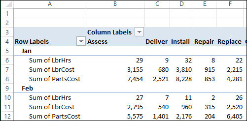
Onscreen, pivot tables can get quite wide, and you can scroll back and forth, to see everything. In the pivot table shown below, there are 3 Values fields, and they are repeated for each of the items in the Column field.
Continue reading “Arrange Value Fields Vertically for Printing”
By default, when you add Report Filters to a pivot table, they are shown in a single vertical list, above the body.

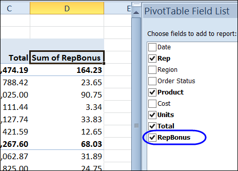
Besides using the fields from a pivot table’s source data, you can create calculated fields. These fields are formulas that can refer to other fields in the pivot table, to perform calculations on the summarized amounts.
In this example, the RepBonus calculated field is added to the pivot table, to show the bonus amounts paid on product sales.
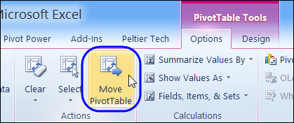
Sometimes you have to move a pivot table, after you’ve created it. That’s not too difficult if the pivot table is small – just select all the cells, cut them, and paste in a new location.
With a very large pivot table, it’s a bit harder – you have to scroll through the worksheet, and try to select all the cells, including any report filters.
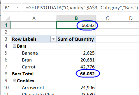
To pull data from a cell in a pivot table, you can use a normal cell reference, such as =B5, or you can use the GetPivotData function, which is specially designed to extract data from a pivot table.
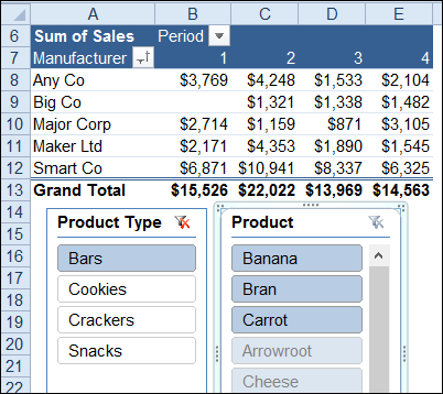
Slicers were introduced in Excel 2010, and they make it easy to filter one or more pivot tables with a single click. In the screen shot below, “Bars” is selected in the product type Slicer. In the Product Slicer, the bars are shown at the top, and the other products are listed below the bars.
You can apply conditional formatting rules to a pivot table, just as you would in other cells on a worksheet. In the screen shot below, cells with amounts above average are filled with light green.

In a pivot table, you can show multiple subtotals for a field, such as Sum, Count and Average. However, there isn’t a setting that lets you show multiple Grand Totals.
With a simple workaround, you can replace the Grand Total with a new field, and show two or more Grand Total calculations. In the screen shot below, the Sum, Average and Max are being calculated.

This solution uses a new field in the pivot table’s source data, with a heading cell, and nothing else in the column.

That field is added to the pivot table, and subtotals are moved to the bottom of each group.

For written instructions, please visit my Contextures website: Pivot Table Multiple Grand Totals
To see the steps for showing multiple grand totals, please watch this short video tutorial.
_______________________
The quickest way to create a chart in Excel is by using a keyboard shortcut. With the following shortcuts, you can create a chart on a separate sheet, or place it on the same sheet as the data.
These shortcuts work for worksheet data, or pivot table data. In this example we’ll create quick Pivot Charts from a pivot table.

To create an embedded pivot chart, on the same sheet as the pivot table, follow these steps:

To see the steps for creating a pivot chart with shortcuts, please watch this short video tutorial.
_________________