When you create a pivot table, do you just slap it together, and hope for the best, or do you spend time experimenting with different calculations, layouts and field arrangements?
Yes, it’s easy to fall into a rut, and create the same type of pivot table, each time that you build one. That makes it quick and easy to get the job done, but you might not be presenting the data in the best way possible.
It’s time to give your pivot table a makeover, so it looks better, and its data is easier to read and understand.
Select a Report Layout
There are three Report Layouts available for pivot tables, and you can read more about these layouts on my Contextures website:
- Compact
- Outline
- Tabular
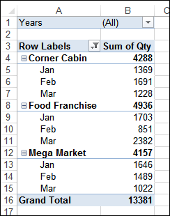
By default, a pivot table is created with the compact layout, which puts all the Row fields in the same column, indenting each field slightly. Instead of showing a field name, the first column heading is "Row Labels", which isn’t too helpful.
Also, unless you select a specific location for the pivot table, it is jammed into the upper left corner of the worksheet, where it looks a bit cramped.
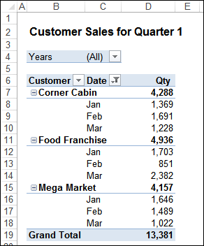
- First, I usually insert a narrow blank column to the left, and a few blank rows above the pivot table, where a heading can be added, to explain what is in the pivot table.
- Next, I turn off the gridlines, to give the sheet a cleaner look.
- Then, I select Outline or Tabular Report Layout, to put the Row fields in separate columns, with their names in the headings.
- With Outline layout, you can adjust the column widths, so the headings fit, and the items will flow into the empty cells to the right.
- For the Value fields, change the headings, to remove "Sum of", and add number formatting. Align the headings to the right, so they are over the numbers.
Use Custom Calculations
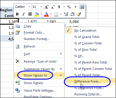
One way to show data from a different view is to use the pivot table’s built-in custom calculations. For example, in addition to showing a simple Sum, Count or Average, show those amounts in one of these formats:
- % of Row Total
- % of Parent Total
- Difference From
- Running Total In
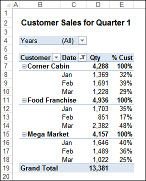
In the next screen shot, I’ve added the Qty field again, and selected to Show Values As % of Parent Total. The heading is changed to % Cust, aligned to the right, and the numbers are formatted as percentage, with 0 decimals.
Arrange the Fields
The way that you arrange the fields is also important in helping to make the data easy to read and understand.
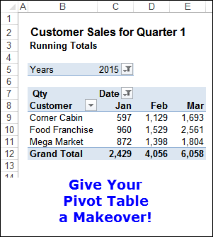
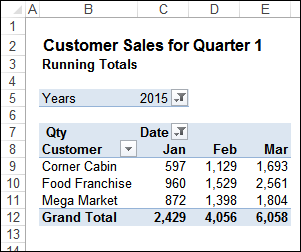
In this example, I’ve selected the Running Total In custom calculation, with the base field of Date (Months). To make it clear what the pivot table is showing, I added a subheading, "Running Totals", below the main heading on the sheet.
With the current field arrangement, the running total goes down the column, and it is difficult to compare the customers and months.
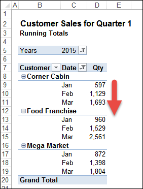
To make comparisons easier, I’ll move the Date field to the Columns area, so the Running Totals go across.
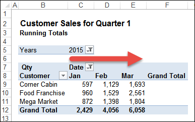
Now it is easier to compare the customers and the months, in this horizontal arrangement.
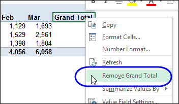
Because the Grand Total for Row isn’t used in a horizontal running total, I’ll remove it.
- Right-click on the Grand Total heading, and click Remove Grand Total.
As the final steps in the makeover, I’ll make these adjustments:
- right-align the Month headings
- make the month columns a bit wider, to add some white space.
- turn off the AutoFit Columns setting, in the Pivot Table options, so the columns will stay at that width.
Give Your Pivot Table a Makeover
Take a look at one of your own pivot tables, and see if it can be improved with a makeover.
- If the pivot table is in the Compact layout, try Outline or Tabular.
- Change one of the Value fields to a custom calculation, to give a different view of the data.
- Experiment with the field arrangement, to find the layout that is easiest to understand.
Don’t get into a pivot table rut!
What other steps do you take to make your pivot tables look good, and have easy to understand data?
Video: Change Pivot Table Report Layout
Watch this short video, to see the 3 Report Layout options, and the different settings available in each layout.
_______________________
