Changing Pivot Chart Affects Excel Pivot Table

After you create a pivot table, you can insert a pivot chart, based on that pivot table. However, if you change the layout of the pivot chart, it will also change the pivot table’s layout.

For example, if I remove City from the chart in the screen shot below, the City field will also be remove from the pivot table.

Continue reading “Changing Pivot Chart Affects Excel Pivot Table”

Show Survey Responses in Pivot Chart

I’ve updated one of the pivot chart sample files on my Contextures website. On the main sheet, there are two pivot charts, showing survey responses by department, and by years of service.

At the top of the sheet, you can select a question from the dropdown list, and view the survey results for that question.

Continue reading “Show Survey Responses in Pivot Chart”

Create Pivot Chart with Shortcut Keys

The quickest way to create a chart in Excel is by using a keyboard shortcut. With the following shortcuts, you can create a chart on a separate sheet, or place it on the same sheet as the data.

Create a Chart Sheet

These shortcuts work for worksheet data, or pivot table data. In this example we’ll create quick Pivot Charts from a pivot table.

  1. First, select any cell in the pivot table.
  2. On the keyboard, press the F11 key, to insert a pivot chart on a new chart sheet.

pivotchartshortcuts02

Create a Pivot Chart on the Data Sheet

To create an embedded pivot chart, on the same sheet as the pivot table, follow these steps:

  1. Select any cell in the pivot table
  2. On the keyboard, press the Alt key, then tap the F1 key.

pivotchartshortcuts

Watch the Chart Shortcuts Video

To see the steps for creating a pivot chart with shortcuts, please watch this short video tutorial.

_________________

Change Pivot Chart Source Data

In an Excel file, you might have a couple of pivot tables on different worksheets. If you create a pivot chart for one of those pivot tables, you might spend a long time setting it up, with specific formatting and design settings.

It would be nice to copy that chart, and use it for another pivot table, but you can’t alter the source data for a pivot chart.

Continue reading “Change Pivot Chart Source Data”

Change Number Format in Pivot Chart

When you create a pivot chart from a pivot table, the numbers on the chart’s axis are in the same format as the pivot table’s numbers. In the screen shot below, the numbers are in General format, with no comma and no decimals.

numberformat01

Video: Change Pivot Chart Number Format

This short video shows how to change the number format for the pivot chart only, or change the number format for both the pivot chart and the pivot table. There are written steps below the video.

Change Pivot Table and Chart

To change the number format in both the Pivot Table and the Pivot Chart, you can change a setting in the pivot table value field. For example, if you want to add a comma separator, follow these steps

  1. In the pivot table, right-click on a cell in the value field. In this example, the Quantity field is in the Values area.
  2. In the popup menu, click Number Format
    • numberformat02
  3. In the Format Cells dialog box, click the Number category
  4. Change the number of decimals to 0, and add a check mark to Use 1000 Separator.
    • numberformat04
  5. Click OK, and the number format is applied to both the pivot table and the pivot chart.
    • numberformat05

Use Different Number Format in Pivot Chart

In some cases, you might want a different number format in the pivot chart, rather than making it the same as the pivot table. In this example, you’ll format the pivot chart to show the numbers as thousands, so the numbers take less room.

Follow these steps to change the pivot chart number format, without affecting the pivot table:

  1. In the pivot chart, right-click a number in the axis, and then click Format Axis.
    •      numberformat06
  2. In the Format Axis dialog box, click Number, in the list at the left.
    • numberformat07
  3. Click the Custom category. This automatically removes the check mark from Linked to Source, which disconnects the axis labels from the formatting in the pivot table.
  4. In the Format Code box, type a code for the formatting, such as: #,”K”;-#,”K”
  5. Click Add, to create the custom number format code, and to apply the format. Only the pivot table has changed – the pivot table numbers are sill in the previous format.
    • numberformat08
  6. Click Close.

_________________

Changing Pivot Chart Layout Affects Pivot Table

If you rearrange the fields in a pivot chart layout, the related pivot table changes too. Unfortunately, there’s no setting you can change if you want the pivot chart and pivot table to work independently.

pivotchartchange

As a workaround, you can create a second pivot table, based on the first one, and arrange it as you’d like. Then, when you change the pivot chart, only the original pivot table is affected. You can hide the first pivot table that’s connected to the pivot chart and use the second pivot table as for printing reports.

If you require several charts based on the same pivot table, but with different layouts, create multiple pivot tables based on the original pivot table. Create one pivot chart from each of the secondary pivot tables, and rearranging one pivot chart won’t affect the others.

___________

Change the Series Order in a Pivot Chart

When you create a pivot chart, the series order is automatically applied. In this example, the product categories had been manually sorted in the pivot table. In the pivot chart legend, the products are in the same order: Crackers, Snacks, Bars and Cookies.

ChartSeries01

In a longer list of items, you might like the series sorted alphabetically, so they’re easier to find in the list.

Change the Sort Order

To change the sort order, follow these steps:

  1. Select the pivot chart
  2. If the PivotChart Filter pane isn’t visible, click the Analyze tab on the Ribbon, then click PivotChart Filter.RibbonPivotChartFilter
  3. In the PivotChart Filter pane, click the arrow in the drop-down list for the field you want to sort. In this example,
    click the arrow for the Legend Fields (series), where the Category field is listed.ChartSeries02
  4. Click Sort A-Z, to sort the categories in ascending order

ChartSeries03

Pivot Table Series Order

NOTE: Changing the series order in the Pivot Chart will also affect the Pivot Table on which it is based.

_________________

Create a Combination Pivot Chart

After you create a column chart from a pivot table, you might want to change it so the chart is a combination chart type. You’d like most of the series to remain as columns, and one of the series to be a line.

In Excel 2007 there are no Combination Chart types that you can choose, as there were in the Excel 2003 Chart Wizard. However, in any version of Excel you can create your own combination charts.

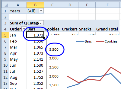
In this example, the chart is a Clustered Column chart type, with the series showing the sales of each category in each city.

ComboChart01

You’d like to change the Cookies series to a line, so it stands out from the other categories.

In the pivot chart, right-click on one of the Cookies columns.

In the shortcut menu that appears, click Change Series Chart Type

ComboChart02

In the Change Chart Type dialog box, click the Line chart type, and click one of the Line subtypes, then click OK.

ComboChart03

The chart is now a combination chart, with columns for Bars, Crackers and Snacks, and a line for Cookies.

ComboChart04

    ___________________________

    For more information on pivot tables, see the Pivot Table Topics on my Contextures web site.

    ___________________________

Use the Chart Wizard to Create a Pivot Chart

In Excel 2003, if you select a cell in the pivot table and click the Chart Wizard button on the Standard toolbar, a default pivot chart on a chart sheet is created. In some cases you might prefer to step through the Chart Wizard so you can set the options as you create the pivot chart.

Create a Pivot Chart with the Chart Wizard

  1. Select an empty cell away from the pivot table and any other data on the worksheet.
  2. On the Standard toolbar, click the Chart Wizard button.
  3. In Step 1 of the Chart Wizard, select a Chart type and Chart sub-type, then click Next.
  4. In Step 2 of the Chart Wizard, click in the Data range box, then select any cell in the pivot table. The entire pivot table will be automatically selected, and its address will appear in the Data range box.
  5. Continue through the Chart Wizard steps, selecting the options you want, then click Finish to create the pivot chart.

Note: After selecting a pivot table as the data range, you can’t return to Step 2 of the Chart Wizard. To use a different data range, create a new chart.

___________________________

For more information on pivot tables, see the Pivot Table Topics on my Contextures web site.